Overview
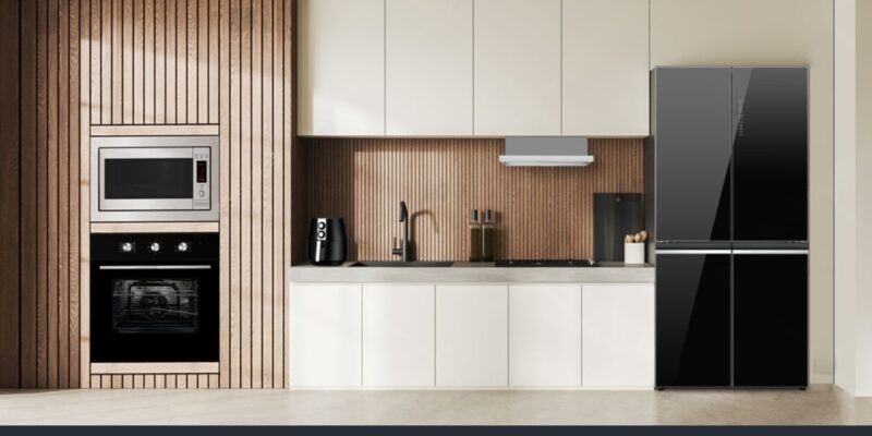
AppliancesStore.in is an online retail platform in India that offers a wide range of home appliances and electronic goods (kitchen appliances, home essentials, etc.). The site aims to provide customers with a seamless, trustworthy shopping experience for appliances with appropriate categorization, offers, product discovery, and checkout flows.
Challenges
-
Large and varied product catalog
With many categories and types of appliances, organizing navigation, filtering, and product discovery in a way that doesn’t overwhelm users was challenging. -
Highlighting promotions & deals
Users expect deals, discounts, “best offers,” etc. The site needed to surface deals effectively without overshadowing regular products or causing confusion. -
Building trust & reducing purchase hesitation
For first-time buyers of home appliances, trust factors (reviews, policies, guarantees, support/contact) are vital. The site had to make these visible and credible. -
Responsive design & performance
High image counts, product grids, banners — making sure the site remains fast and usable on mobile / slower networks is a critical challenge. -
Streamlined checkout / conversion funnel
Minimizing friction from product selection → cart → checkout, reducing bounce in between steps.
Solutions
-
Intuitive navigation & categorization
-
Structured main menu with high-level categories (Kitchen, Home, Deals, etc.)
-
Submenus / drop-downs for subcategories to let users drill down quickly
-
Featured / popular categories on homepage to guide user choices
-
-
Prominent deal sections & banners
-
Banner slider / hero section showing top offers / discounts
-
“Deals of the Day,” “Top Offers,” “New Arrivals” sections on homepage to surface promotions
-
Badges (e.g. “Best Deal,” “Hot,” “Limited Stock”) on product cards to draw attention
-
-
Trust & social proof elements
-
Customer reviews / ratings on product pages
-
Visible policies (return, warranty, delivery) in footer or near product/checkout
-
“Contact / support / help” pages easily accessible
-
Clear display of discounts (original vs sale) and transparency in pricing
-
-
Performance optimizations & responsive layout
-
Image compression, lazy loading for offscreen images
-
CSS/JS optimization to reduce render-blocking resources
-
Mobile-first / adaptive layouts so on small screens content is stacked, touch targets are generous
-
-
Streamlined purchase flow & CTAs
-
Clear “Add to Cart” / “Buy Now” buttons on product listings and product detail pages
-
Persistent cart preview / mini-cart to let users see what they’ve selected
-
Minimized steps in checkout, with necessary fields only, guest checkout option
-
Confirmation screens and clear progress indicators during checkout
-
Results
-
Improved product discovery & engagement
Users could navigate and find relevant categories more easily, explore deals more readily, and spend more time browsing. -
Higher conversion rates
With reduced friction, clearer CTAs, and better trust cues, more visitors moved to complete purchases. -
Increased credibility & buyer confidence
Through policies, reviews, contact info, transparent pricing, users felt safer transacting. -
Better performance & mobile UX
Faster page load times and a layout that adapts gracefully improved user experience across devices, especially mobile. -
Scalable foundation for growth
The structure supports addition of more categories, brands, deals, features (e.g. wishlists, reviews, personalization) without needing a major overhaul.


